

Home › Graphic Communication › Climate Change Project Ideas
Need a climate change Graphic Communication project idea for GCSE, A Level or BTEC? Pick one issue, one audience and one action. You might design a poster about hotter streets, a social campaign about reusing clothes, or a clear guide to what to do during heavy rain. A strong project shows how your idea changes as you research, test and improve it.
This guide gives you an original practice brief, a possible student-style response, more global warming graphic design ideas, and real designers and agencies to research. The example is a suggested route, not a past-paper question, an official BTEC assignment or a model answer to hand in.
What could I do for a climate change graphic design project?
Start with a question someone your age might ask: “Why is our town so hot in summer?” or “How do I explain flooding without a page of tiny text?” Then decide whom your design is for. A message for younger pupils, local families or your college will need different words, imagery and formats. Check your facts with a reliable source such as the IPCC climate report or the Met Office guide to climate effects.
Climate communication can explain a cause, a local impact, a response to the impact, or a way to reduce emissions. Keep these separate in your research. A poster about finding shade on a hot day is useful, but it does not claim that shade alone stops global warming.
An original practice brief: make a local heat campaign
Practice client: A local youth centre asks you to help 14–19-year-olds understand hotter summer streets and find places to cool down. Design a small campaign for the centre and its social channels. It should have one clear message, an easy action and an accessible layout. This is a self-directed practice brief created for this article; if you are working on a real assessed brief, use the instructions from your teacher or awarding body.
You might visit a local street, take your own photos, sketch places with trees and shade, and ask three classmates what they would actually notice on a poster. Do not invent a measured temperature map: if you use local data, name the source and date. If you do not have data, make a clearly labelled diagram of a suggested route, not a factual map.
What might a student response look like?
Research: A student takes their own photographs of one familiar route at different times, notes where the pavement feels exposed, and collects examples of readable maps and public information. They find that classmates want a quick visual answer rather than a long warning. They write a short aim: “Help people spot a shaded route and find somewhere to pause.”
Generate ideas: They draw several thumbnails: a route map, a poster led by a large sun, and a paper-cut design showing the difference shade makes. The first map has too many symbols, so they simplify it to a route, a legend and one useful action. Their notes show why they rejected the busier version.
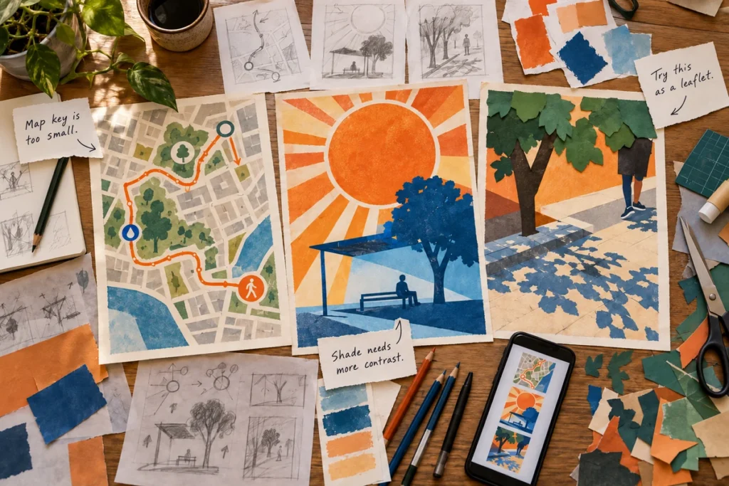
Test and refine: They print a poster at actual size and show a phone version to five peers. Several cannot read the small map key, so the student increases its type size and contrast. They check that colour is not the only way to understand the route, add clear labels, and keep the main message short. The sample feedback is part of this imagined example; collect real feedback for your own project.
Possible outcome: A poster for the centre, a four-panel social carousel and a folded take-away guide share one visual system: the same type choices, route shape and limited colour palette. Each format is adapted to its viewing distance and purpose. The example images show a design route created for this guide, not an actual student submission or a finished map for public use.

How does the project change for GCSE, A Level or BTEC?
The same starting idea can become very different coursework. Check your exact board, course level, unit and current teacher brief: “BTEC Art and Design” covers more than one qualification. These are useful ways to scale the practice idea, not a checklist that replaces a specification.
| Route | A manageable version | What to show in your work |
|---|---|---|
| GCSE Graphic Communication | Make a focused poster and one adapted social tile for a particular audience. Draw several layouts, use your own local photos or illustration, then improve legibility. | Relevant designer research, observation and recording, type and colour trials, feedback, a refined outcome and an explanation of your decisions. AQA lists posters, branding, typography, web and other communication formats in its GCSE Graphic Communication specification. |
| A Level Graphic Communication | Ask a more searching question: “Can a hopeful local heat message be accurate and still change what people notice?” Investigate visual language and evidence, build a flexible system across several formats, and test its accessibility. | Critical comparison of designers, a clear personal line of enquiry, verified sources, deeper material and digital experiments, audience testing and a sustained final response. See AQA’s A Level content as one board example. |
| BTEC Level 1/2 Tech Award in Art and Design Practice | Treat the youth centre as a practice client. Work to simple constraints such as age group, space and deadline; produce trials and a clear final item. | Research, idea generation, making and review can inform your practice. For assessed Component 2, respond to the actual externally set brief, not this one. Check the Pearson Tech Award course page. |
| BTEC Level 3 Art and Design Practice | Develop the practice client into a realistic industry-style proposal: audience and channel research, a coherent identity, several prototypes and a short presentation explaining the choices. | Record client constraints, design development, feedback, revisions, production and evaluation. The 2019 Level 3 Art and Design Practice specification includes vocationally relevant project work; your actual programme and unit may differ. |
At any level, make your own response to your own assessed task. A well chosen small brief with visible development can work better than a huge “save the planet” campaign with no clear audience.
Six ways a climate project could look
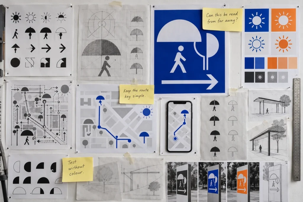
These images show different media and ways to develop an idea. Look at the decisions recorded on the pages, then use your own subject, research and materials.
GCSE: sketchbook thinking and a linocut poster
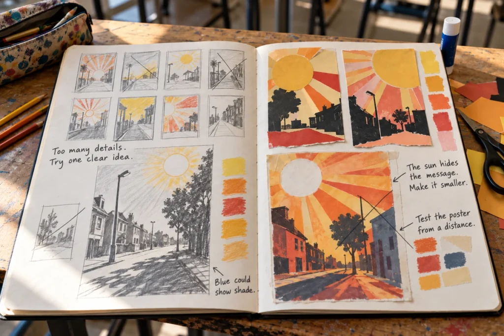
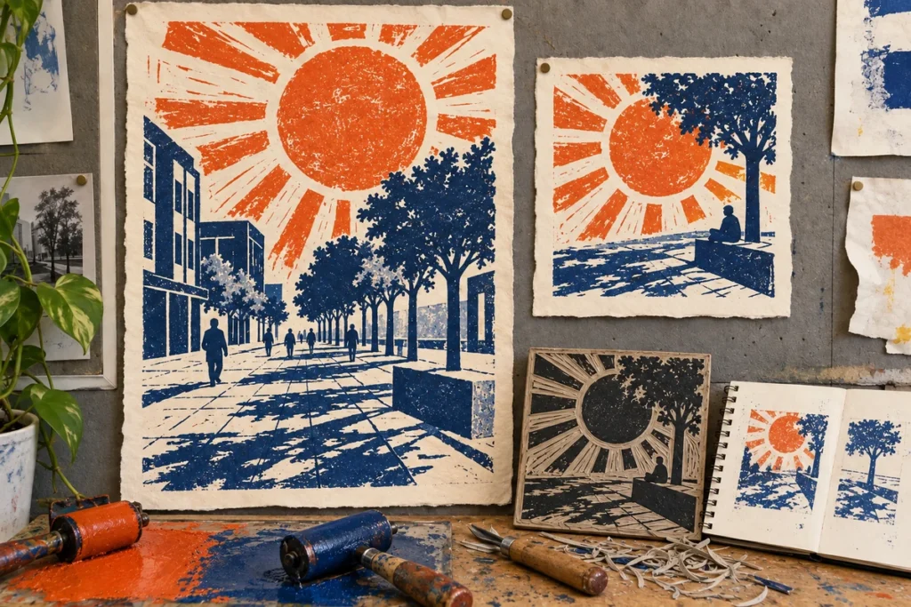
A GCSE route might start with several sun-and-street thumbnails. The notes on the sketchbook page explain why one version is rejected and what should be tested next. A two-colour linocut then gives the poster and smaller tile a consistent handmade look. The carved block and trial prints show the process as well as the outcome.
A Level: photomontage and an information system
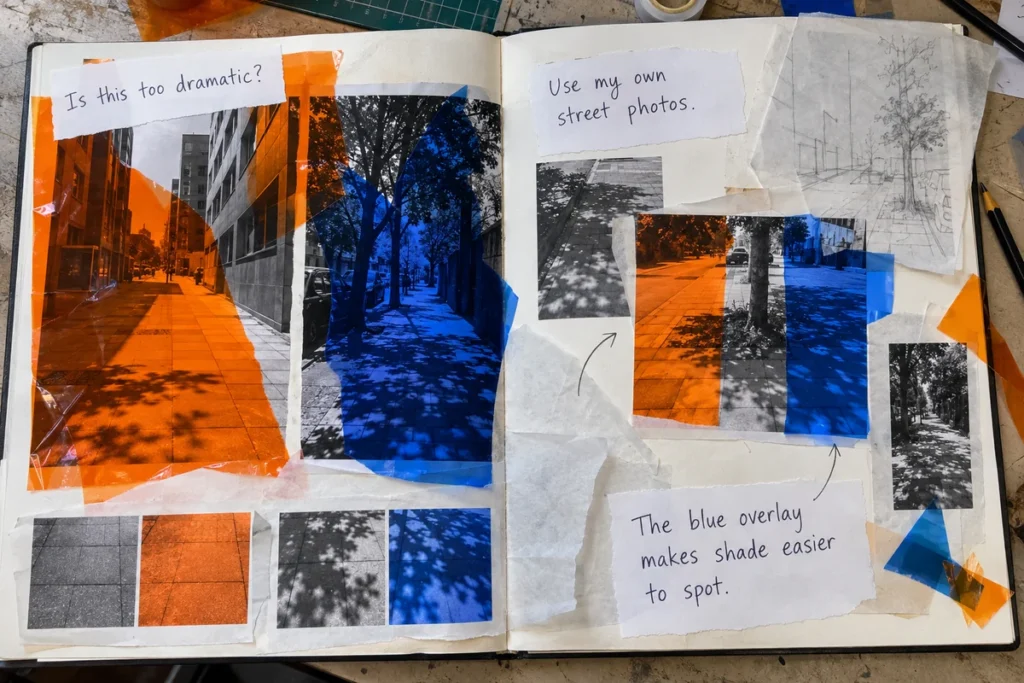
An A Level route can question how a dramatic image affects the accuracy of a climate message. The mixed-media spread tests the effect of blue acetate over original street photographs. Another route uses a sign, symbol, phone map and black-and-white contrast test to ask whether a passer-by could actually use the information.
BTEC: responding to a brief in different media
For Level 1/2, a clothes-repair event gives the student a clear audience and a manageable set of outcomes. The stencil, fabric and printed flyer show how one idea develops through materials. A Level 3 response could present a more extensive heavy-rain campaign, with rough layouts, mobile panels, a leaflet and a display prototype, then explain changes made for the audience.
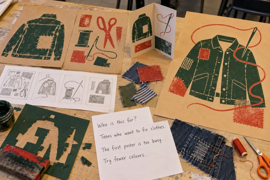
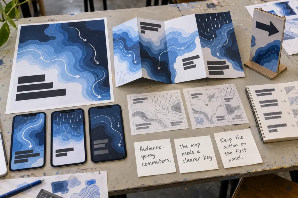
These generated visuals were made for this guide. They are examples of possible approaches, not photographs of submitted student coursework. Your own assessed project must use your own development and the brief set by your course.
Which graphic designers and agencies could I research?
Study how professionals solve a communication problem. Link to their published projects in your research and write about a specific decision; create your own images, wording, layout and identity. The suggestions below describe real work, while the “try this” column is a fresh exercise for your project.
| Designer or agency | What their work can teach you | A different experiment to try |
|---|---|---|
| Ed Hawkins: Warming Stripes | A climate scientist turns a long data story into a simple visual idea. | Find a trustworthy source for one local measure. Invent your own visual form with a key, timeframe and source; do not reproduce the stripes. |
| Pentagram: Great Green Wall Frontline | The agency built an identity that works for a campaign and a large community. | Design two original symbols for your practice youth centre, then test whether either remains clear on a poster and a small phone screen. |
| Pentagram / Giorgia Lupi team: CTrees | The case study explores how identity and information design can help people understand a climate data organisation. | Try two ways of explaining one verified fact: a labelled diagram and a short typographic message. Ask a peer which is clearer. |
| Nice and Serious: WWF Imagine England | The agency shaped a low-carbon message for a specific audience, using future-facing storytelling and several formats. | Ask what your teenage audience already cares about. Write two different messages for that audience and test which one makes sense. |
| Futerra: Low Carbon Lifestyles Wheel | Its behaviour-change framework considers the barriers and benefits around an action. | If your project asks people to change a habit, list one real barrier and one honest benefit, then make the call to action specific. |
A useful sketchbook sentence sounds like this: “I noticed that Nice and Serious tailored the message to its audience. I tested two versions for my youth-centre audience, and the shorter one was easier to understand.” Then show both versions and the feedback. See also ideas for experimenting with typography and how Graphic Communication coursework earns marks.
More global warming Graphic Communication project ideas
- “Why does this street feel hotter?” Create a photo-led local heat poster and a simple explainer. Check every factual claim and say where it came from.
- “What if our school flooded?” Make a clear visual guide to a proposed school scenario, with symbols and hierarchy. Do not present an invented evacuation plan as real safety advice.
- “Can we keep clothes longer?” Design a repair-event identity, poster and social tile for a proposed school club. The call to action is concrete and local.
- “How much food gets wasted?” Design an infographic using a named, dated source, or run a properly described small survey and label its limits.
- “Would anyone read a climate leaflet?” Compare an illustrated fold-out with a short phone carousel and test which format your chosen audience finds easier to use.
- “What could a greener journey look like?” Make a map-inspired campaign with an invented route, or use your own verified local information with permission and clear attribution.
The theme is a starting point, not the final design. Narrow your question, gather first-hand material, test more than one visual idea and keep a record of what you changed.
Questions students ask about climate change design projects
Can I do a global warming poster for GCSE Art?
Yes, a poster can be a Graphic Communication outcome if it grows from research, drawing or recording, experiments and refinement. Start with a specific audience and message; a final poster on its own does not show the full project journey.
Do I need to draw everything by hand?
No. You can combine your own photography, drawing, cut paper, type and digital layout, subject to your course rules. Explain why you chose each method and show how you refined the work.
Can I copy a campaign by a famous design agency?
Research it, link to it and analyse its design decisions. Then make an independent response with your own concept, images, words and layout. Do not lift a logo, slogan, data graphic or agency artwork into your final piece.
Is this an official exam or BTEC brief?
No. It is an original practice scenario. Use your board’s actual starting point or Pearson’s live assignment when your work is assessed, and follow your teacher’s instructions.
For another practical starting point, see this GCSE Graphic Communication project example. If you want feedback on a project you have already started, read about online portfolio feedback.
No responses yet