
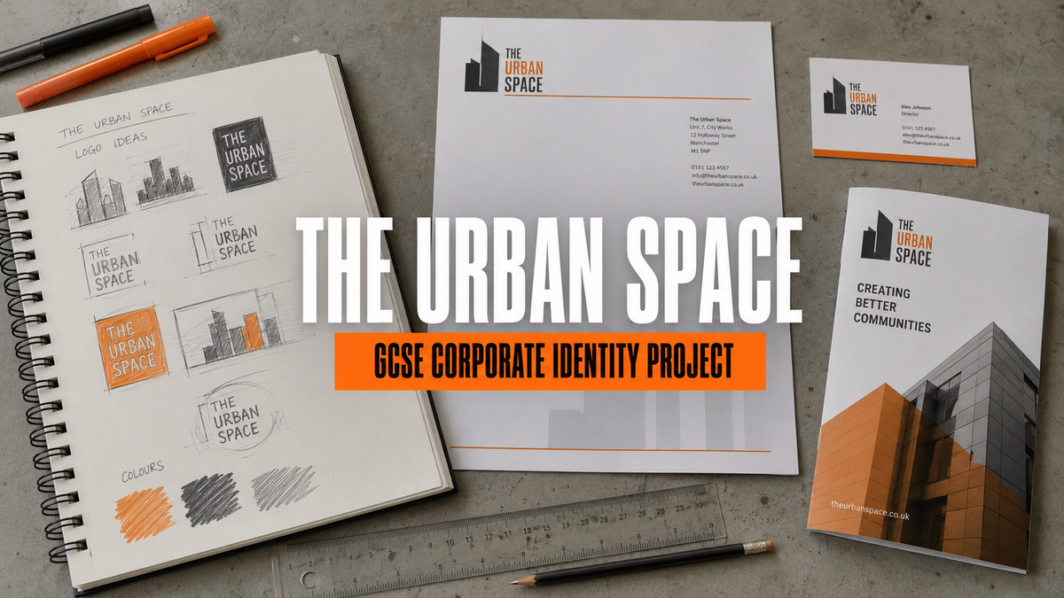
Home › Free Art Resources › Graphic Communication › The Urban Space Corporate Identity Project
This fictional project example is written in the voice of a GCSE student. It shows one possible route through an AQA Graphic Communication brief; it is not a formula to copy or a promise of a particular grade.
My first GCSE Graphic Communication project was to create a full corporate identity for The Urban Space, a fictional architectural consultancy specialising in inner-city living. The brief required me to design a logo, apply it to a stationery set and produce a brochure promoting one of the company’s flagship developments.
At first, the project sounded as though it was mainly about making a logo. I soon realised that a corporate identity is much wider than one symbol. The logo, typefaces, colours, photographs, grid, tone and printed items all need to feel as though they belong to the same company. They also need to communicate with the intended audience.
Understanding the GCSE Graphic Communication brief
Before making anything, I rewrote the brief in my own words. This helped me identify the practical requirements and stopped me from concentrating on the logo while forgetting the brochure.
- Client: The Urban Space, an architectural and building-design consultancy.
- Specialism: imaginative, practical and sustainable inner-city living.
- Audience: property developers, investors, local organisations and potential residents.
- Required outcomes: logo, business card, letterhead, compliment slip, envelope and an eight-page development brochure.
- Message: modern and confident, but also human, useful and connected to real city communities.
- Practical needs: the identity must work in colour, in black only, at large scale and at small business-card size.
I kept returning to this list whenever I made a decision. A design can look attractive but still fail if it does not suit its client, purpose, audience or format. The GCSE Graphic Communication course guide explains why communication and audience are just as important as decoration.
Stage 1: Researching the company and the urban environment — AO1 and AO3
I began by collecting first-hand visual information. I photographed tower blocks, newer apartment buildings, brickwork, concrete surfaces, scaffolding, repeated windows, road markings and sections of maps. I also made quick drawings of building silhouettes and recorded words that described the company: urban, functional, confident, connected, sustainable and in progress.
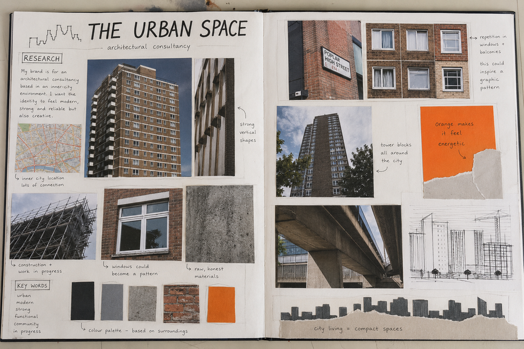
My annotations do more than label what is on the page. For example, I wrote that repeated windows could become a graphic pattern and that tall vertical shapes could influence the logo. This turns recording into a useful next step. The notes also show how my observations affect my intentions, which supports AO1 and AO3.
Looking at professional design without copying it
I also investigated professional identity and place-branding projects. I did not copy their logos. Instead, I asked how each designer created a clear system across different items.
- DNCO’s identity for CO—RE helped me notice how material textures and a restrained palette can connect a property business with architecture.
- DNCO’s HUB Residential project showed me how a corporate identity can communicate ideas about people and living places, rather than only showing buildings.
- Mytton Williams’ DunnHillam case study was relevant because its client is an architecture and urban-design studio.
- FortyTwo Studio’s Brown & Brown identity gave me another example of branding created for an architectural practice.
- Ascend Studio’s real-estate branding work helped me understand that one identity may need to work across brochures, digital screens, signs and other formats.
My research became useful when I extracted principles such as a limited palette, repeated grids, strong hierarchy and consistent spacing. This is stronger AO1 evidence than copying a designer’s biography. The GCSE Artist Research guide has more advice about turning contextual research into your own decisions.
Stage 2: Generating logo ideas — AO1, AO2 and AO3
I produced lots of small thumbnail sketches before using design software. Working quickly allowed me to try letters, building shapes, street grids, windows and negative space without becoming too attached to my first idea.
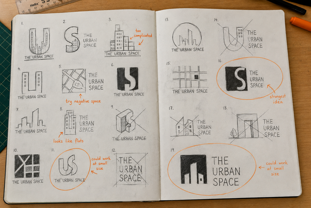
Some sketches were too detailed, especially those containing a complete skyline. They might work on a poster but would become unclear on a small business card. I selected an idea combining the letters U and S with vertical window shapes because it linked the company name with city buildings.
A useful annotation at this stage follows a simple pattern: intention → action → result → judgement → next step. For example:
“I wanted the symbol to suggest both the company initials and apartment blocks. The interlocking U and S creates useful negative space, but the small window details may disappear when reduced. I will simplify the mark and test it at business-card size.”
This kind of comment is more valuable than “I like this one”. More examples can be found in the guide to annotating a GCSE Art sketchbook.
Stage 3: Refining the strongest logo — AO2
I redrew my strongest idea on squared paper and used tracing paper to alter one feature at a time. I compared a chunky version, a narrow version and a simplified version. I removed window lines, adjusted the balance between the U and S and tested the mark in one colour.

This is where I concentrated on GCSE Art AO2. Refinement is not simply making the same design neater. It means changing the design so that it communicates more effectively.
Stage 4: Testing colour and typography — AO2 and AO3
I sampled colours from my urban research. Concrete grey and charcoal connected with architecture, while orange reminded me of construction signs and created an energetic focal colour. I rejected a blue palette because it felt too similar to a general financial or technology company.
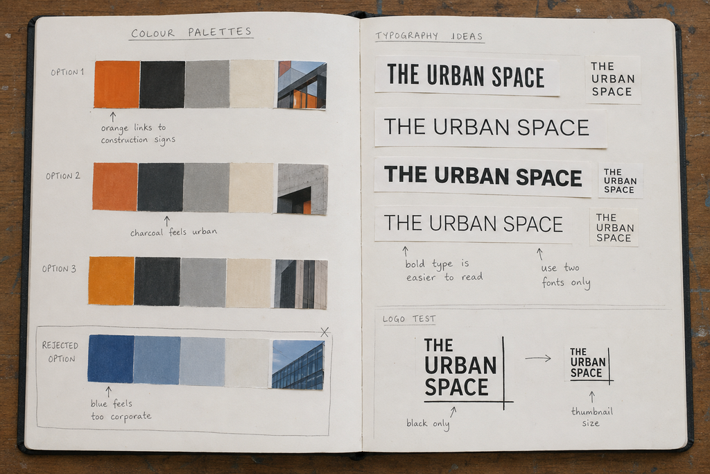
For typography, I compared several sans-serif styles. The strongest option had enough weight to feel confident while remaining easy to read. I limited the identity to two type styles and tested the name at thumbnail size. The principles in the Visual Hierarchy in Graphic Communication guide helped me organise the company name and supporting information.
Stage 5: Applying the identity to stationery
I applied the identity to an A4 letterhead, business card, compliment slip and envelope. I used the same grid, orange rule and type hierarchy so that the set looked related. I printed rough versions at actual size, cut them out and placed them together.
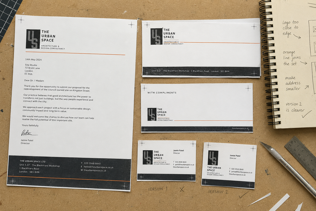
The first business card placed the logo too close to the edge. The address was also too prominent on the letterhead. I reduced the secondary text and increased the clear space around the symbol. These are small changes, but they improve hierarchy, legibility and consistency.
Stage 6: Responding to feedback and changing direction
When I reduced the U/S monogram to its real business-card size, several classmates found it difficult to read. I recorded their responses with a simple tally and compared the monogram with three more direct building marks. The simpler outline was easier to recognise and still retained the vertical city idea from my research.
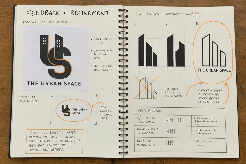
Changing direction did not mean that the earlier work was wasted. The new mark grew from the same observations, shapes and tests. Recording why I changed it strengthens AO2 and AO3 because the decision is visible and justified.
Stage 7: Planning the flagship development brochure
I invented a flagship development called Canal Yard, a mixed inner-city housing scheme built around a canal-side public space. Before designing full pages, I planned an eight-page structure:
- Front cover and main image
- Short introduction to Canal Yard
- Location and transport connections
- The design vision
- Apartment types and simple plans
- Key facts and facilities
- Sustainability and community
- Back cover and contact details
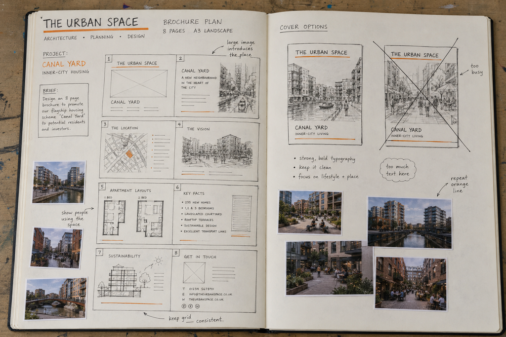
I made two cover thumbnails and rejected the busier version. I also planned where a large image, map, diagrams, short blocks of text and orange navigation features might appear. This shows composition and sequence being considered before the outcome. The GCSE Art Sketchbook Guide explains how planning pages can make the creative journey easier to follow.
Stage 8: Developing the brochure layout — AO2 and AO3
I printed three layout variations and compared them side by side. Version 1 contained useful information but was crowded. Version 2 had more space, although the hierarchy was weak. Version 3 used a clearer modular grid, a larger main image and a consistent orange information panel.
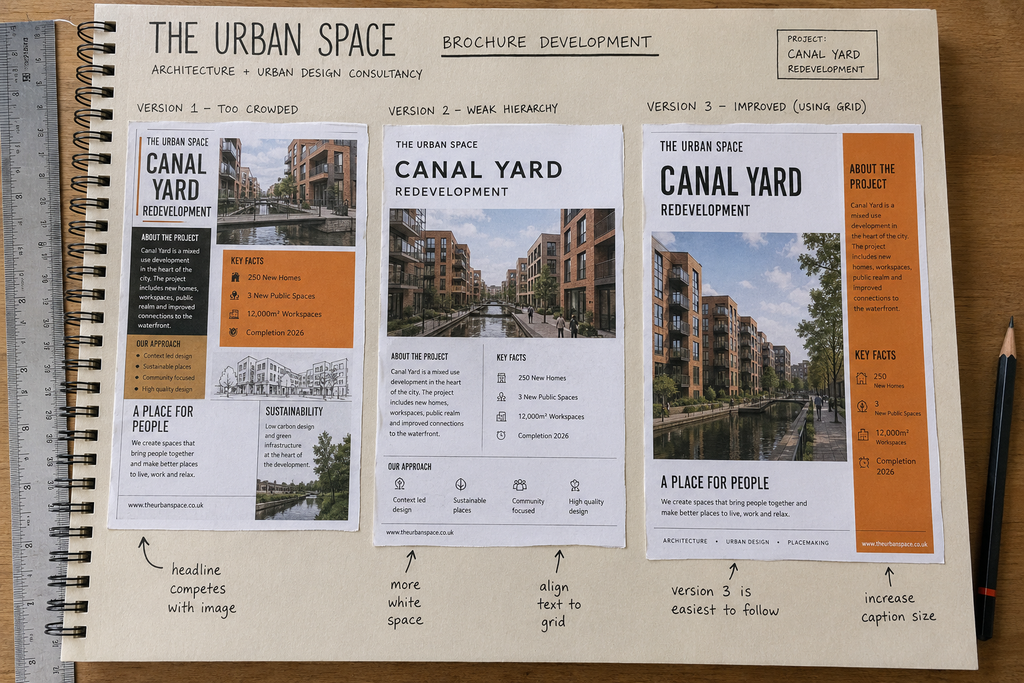
I selected Version 3 but still identified one change: the small caption needed to be larger. Calling a design “final” does not mean pretending it is perfect. A short, honest evaluation shows that I understand both its strengths and remaining limitations.
Stage 9: Presenting the final corporate identity — AO4
My final response included the simplified logo, stationery set and printed Canal Yard brochure. I repeated the same charcoal, cream and orange palette, sans-serif typography, grid and fine orange rule across every item. The formats are different, but the visual language makes them feel like one identity.
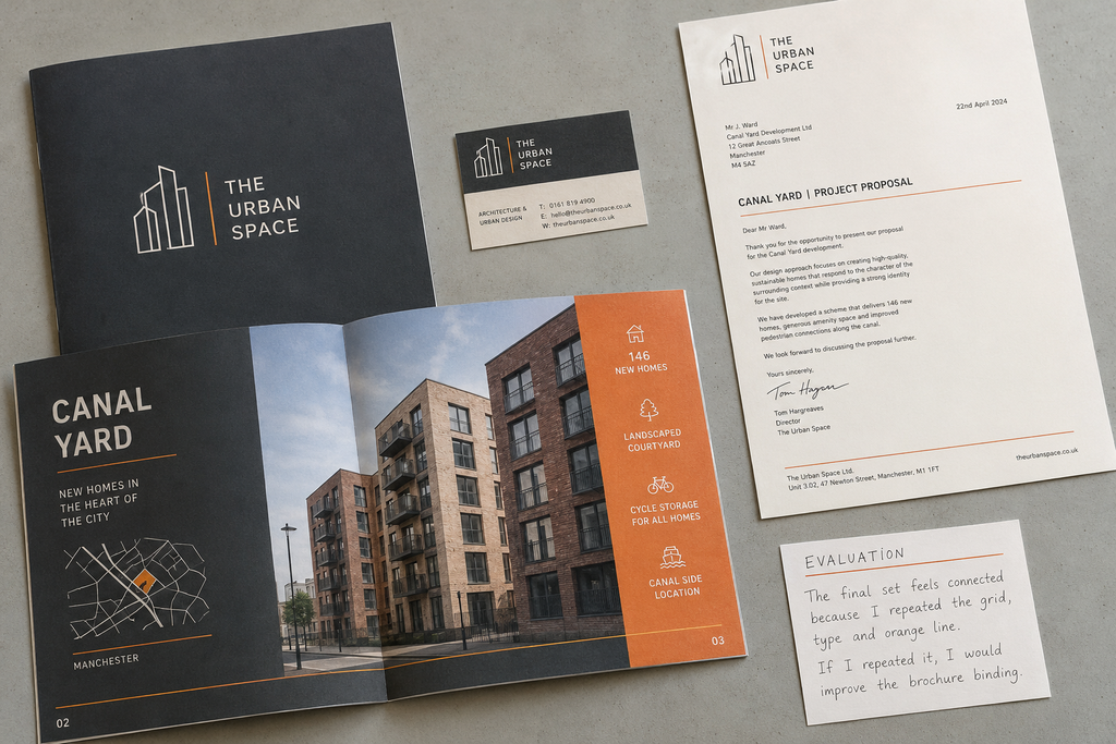
This stage supports GCSE Art AO4 because I present a personal and meaningful response that realises the brief. The finish matters, but AO4 is also about whether the outcome grows convincingly from the investigation.
How this project meets AQA AO1–AO4
| AQA Assessment Objective | Evidence in The Urban Space project | What I must make clear |
|---|---|---|
| AO1: Develop ideas through investigations, demonstrating critical understanding of sources. | First-hand urban research; investigation of relevant design studios; logo thumbnails; principles taken from professional identity systems. | I explain exactly how a source changes my own colour, type, grid, imagery or logo decisions rather than copying it. |
| AO2: Refine work by exploring ideas, selecting and experimenting with appropriate media, materials, techniques and processes. | Logo variations; tracing-paper refinement; colour and type tests; actual-size printing; stationery trials; brochure layout comparisons. | I compare, select, reject and improve. Each experiment leads to a decision. |
| AO3: Record ideas, observations and insights relevant to intentions as work progresses. | My own urban photographs and drawings; flatplans; annotations; peer feedback; print tests; evaluations and next steps. | My recording stays relevant to the brief and documents the work while it develops. |
| AO4: Present a personal and meaningful response that realises intentions and demonstrates understanding of visual language. | A coherent logo, stationery set and Canal Yard brochure using a connected identity system. | The final response visibly brings together selected ideas from AO1, AO2 and AO3 and communicates to the intended audience. |
The wording above follows the current AQA GCSE Art and Design scheme of assessment. Always follow the specific instructions given by your teacher and check the current specification.
My final GCSE Graphic Communication checklist
- ☐ Have I explained the client, audience, purpose and required outcomes?
- ☐ Have I collected useful first-hand urban photographs, drawings and textures?
- ☐ Have I investigated relevant designers and shown how they influence my thinking?
- ☐ Have I created enough quick logo ideas before selecting one?
- ☐ Have I tested the logo in black, in colour, large and at actual small size?
- ☐ Have I compared typefaces, colour palettes, grids and layout alternatives?
- ☐ Do my annotations explain intention, result, judgement and next step?
- ☐ Have I responded visibly to testing or feedback?
- ☐ Does the stationery work as a coordinated set?
- ☐ Does the brochure use clear hierarchy, legible text and a planned sequence?
- ☐ Can every part of the final identity be traced back through my development?
What I learned from The Urban Space project
The most important thing I learned was that Graphic Communication is a process of solving visual problems. My first idea was not automatically my best idea, and a logo that looked successful at large size did not necessarily work on a business card. Research gave me starting points, experiments revealed problems, annotation helped me decide what to change and the final outcome brought those decisions together.
My work still has the slight imperfections of a GCSE project. Some cutting and printing could be more accurate, and I would improve the brochure binding if I repeated it. However, the final identity answers the brief and the sketchbook makes my thinking visible. That development is more important than trying to make every early page look like it came from an established design agency.
Would clearer feedback help your GCSE Graphic Communication project?
If you are unsure whether your research, development, annotation or final outcomes provide enough AO1–AO4 evidence, explore the free GCSE Grade 9 advice or find out how to get independent portfolio feedback.
No responses yet