

Visual Hierarchy in Graphic Communication: How Designers Control What We See First
Visual hierarchy is the order in which a viewer notices, reads and understands the parts of a design. It helps an audience recognise what matters first, what supports it and where to look next. In a successful poster, publication, package, identity or screen design, this order feels natural. The viewer may not consciously notice the decisions behind it, but those decisions shape the whole experience.
For GCSE and A Level Graphic Communication students, visual hierarchy is not an optional finishing touch. It is one of the main ways in which ideas become clear, purposeful and appropriate for an audience. A design can contain excellent photography, skilful illustration and attractive typography, yet still communicate poorly if all of those elements demand attention at once.
This guide explains how hierarchy works, how influential designers have used it in very different ways and how you can develop stronger hierarchy through research, thumbnails, testing and refinement.
What is visual hierarchy?
Visual hierarchy gives information different levels of importance. A primary element attracts attention first. A secondary element supports or explains it. Tertiary information supplies details that can be read after the main message has been understood.
- Primary information might be a campaign message, product name, exhibition title or dominant image.
- Secondary information might identify the organisation, describe the event or provide a short supporting statement.
- Tertiary information might include a date, venue, website, price, sponsor or legal detail.
Hierarchy does not mean that tertiary information is unimportant. It means the information is presented at the right moment. A viewer usually needs to understand what something is before deciding whether to read the smaller details.
Hierarchy creates a route through a design
Imagine that every element in a composition is speaking. If every element speaks at the same volume, the result is noise. Visual hierarchy allows one element to lead, another to answer and smaller elements to provide detail. The design becomes a guided route rather than a collection of competing parts.
That route may be quick and direct, as in a road-safety poster, or slower and exploratory, as in an arts magazine. There is no single correct reading order for every brief. The correct hierarchy is the one that suits the message, format, audience and viewing conditions.
Why visual hierarchy matters in Graphic Communication
Graphic Communication has a job to do. It may need to inform, persuade, identify, explain, warn, guide or entertain. Hierarchy connects the visual appearance of a design to that purpose.
- It improves clarity. The audience can identify the main message quickly.
- It controls emphasis. The designer chooses what receives attention instead of leaving the result to chance.
- It reduces effort. Related information is grouped and unnecessary competition is removed.
- It creates character. Calm, urgent, formal, playful and rebellious designs use different hierarchical rhythms.
- It supports consistency. A clear system can work across a poster, social tile, programme, package or website.
- It helps accessibility. Clear levels, readable contrast and predictable grouping help more people understand the content.
The main tools used to create visual hierarchy
Designers rarely rely on one device alone. Strong hierarchy usually comes from several decisions reinforcing one another.
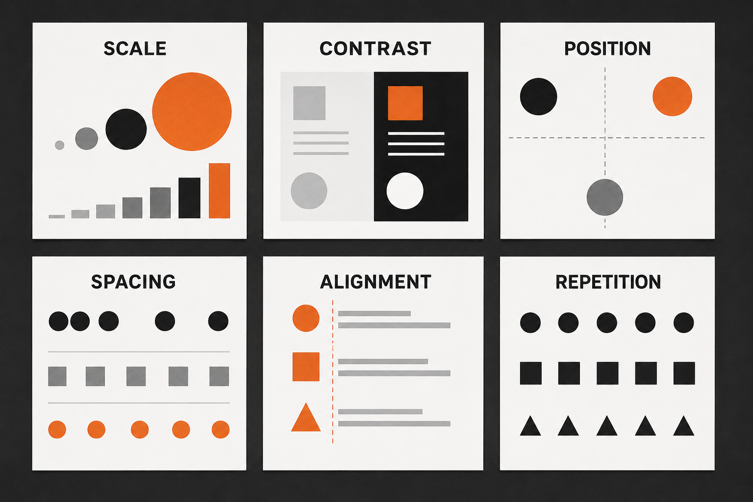
1. Scale
Large elements normally attract attention before small ones. A headline does not become dominant simply because it is technically a heading; it becomes dominant when its scale is meaningfully different from the surrounding information. The contrast must be strong enough to be noticed.
2. Typographic weight and style
Bold, condensed, italic, extended or uppercase type can create emphasis. However, using many typefaces or weights can weaken the hierarchy because the viewer has too many visual signals to interpret. A limited type family often provides all the variation a design needs.
3. Tonal and colour contrast
A bright orange word in a mostly monochrome composition will attract attention. So will a white shape on black, a dark image among pale elements or a highly saturated colour surrounded by muted colour. Colour should identify a level or function; if every element is highlighted, the highlight loses its meaning.
4. Position
Placement affects importance. An isolated element near the top of a page may be read before a cluster at the bottom. A central element can feel stable and commanding, while an element near an edge can feel active or unexpected. Position should be tested in relation to the format rather than treated as a fixed rule.
5. Space and proximity
Space is active. It separates levels, groups related information and gives important elements room to operate. Items placed close together appear connected; items separated by a larger gap appear to belong to different groups. Students often try to improve hierarchy by making a heading larger when the real problem is insufficient space around it.
6. Alignment and grids
Alignment creates relationships between elements that may be physically separated. A grid helps organise those alignments consistently. The grid does not decide the hierarchy by itself, but it provides a structure within which scale, position, space and contrast can work together.
7. Repetition and variation
Repeated shapes, type treatments, colours or intervals establish a pattern. Changing one part of that pattern creates emphasis. Repetition can also connect separate formats, helping a poster, programme cover and social graphic feel like one campaign.
8. Image choice, crop and direction
A face, strong silhouette, close crop or directional gesture can become the visual entry point. The gaze of a photographed person, the angle of a building or the movement of an illustrated line can lead the viewer towards text. The image and typography should therefore be composed together, not designed as separate layers.
Weak and strong hierarchy compared

A weak design is not necessarily untidy. It may be carefully aligned and competently made, yet still lack a clear order. Common problems include headings and details set at similar sizes, too many bold elements, insufficient space, several focal images and decorative devices that compete with the message.
The stronger example makes the title unmistakable, keeps the image in a supporting relationship and groups the practical details. The viewer can glance at the design, understand the event and then choose to read further. Importantly, the strong version does not require more content or more effects. It requires better decisions.
How different designers use visual hierarchy
Studying designers is most useful when you investigate the decisions behind their work. Avoid reducing a designer to a surface recipe such as “use Helvetica” or “tilt the text”. Ask how the work controls attention, creates relationships and suits its context.
Josef Müller-Brockmann: hierarchy through grid, rhythm and proportion
Swiss designer Josef Müller-Brockmann is closely associated with ordered grids, asymmetric composition and precise typographic relationships. In concert posters such as Musica Viva, large geometric movement provides the first visual impact while smaller type supplies information in a controlled secondary level. The composition feels energetic, but its energy is organised.
The lesson is not that every design should look Swiss. It is that a clear underlying structure can support dramatic differences in scale, direction and rhythm. MoMA records Musica Viva as a 1958 concert poster made using linocut and letterpress, reminding students that strong hierarchy existed long before digital layout tools.
Massimo Vignelli: hierarchy through reduction and systems
Massimo Vignelli used grids, limited typographic choices and disciplined relationships to make complex information feel coherent. His work demonstrates that hierarchy can come from reduction: fewer type styles, fewer colours and carefully repeated rules.
His 1972 New York subway diagram prioritised relationships between routes over literal street geography. Cooper Hewitt notes that the map distorted the built city in order to reveal connections. This is an important principle for information design: hierarchy involves deciding what the audience needs most, then reducing or subordinating what might interfere with that purpose.
Saul Bass: hierarchy through the single memorable idea
Saul Bass often built posters and title sequences around one reduced symbol: a fractured figure, a hand-cut shape or a sharply simplified object. The central image communicates mood and concept before the supporting typography is read. This is hierarchy through conceptual focus. Instead of presenting several illustrations of equal importance, the design identifies one memorable sign and makes everything else support it.
Paula Scher: hierarchy through expressive typography
Paula Scher shows that hierarchy does not have to be quiet or minimal. Her work for New York’s Public Theater uses bold differences in scale, weight, spacing and direction. Typography carries both information and personality. Cooper Hewitt describes the Public Theater identity as combining letters of different sizes, weights and spacing, drawing on the directness of nineteenth-century wood type posters.
Although many elements may be large or energetic, they are not arbitrary. Selected words become anchors. Blocks of type create rhythm, and the typographic voice suits the public, theatrical character of the organisation. Students can learn from the way Scher turns the wording itself into the dominant image.
David Carson: hierarchy through controlled disruption
David Carson is known for editorial work that questions conventional grids, predictable text flow and consistent placement. Cropping, layering, distressed type and abrupt changes of scale can make the reading experience feel fragmented or emotional. AIGA’s Eye on Design describes his work as demonstrating that editorial layouts did not have to follow established rules for image placement and consistent typography.
This does not mean that hierarchy disappears. Instead, it can become less linear. A dominant fragment, texture or word may create an entry point, after which the viewer explores. The crucial distinction is between controlled disruption and accidental confusion. Breaking a grid is effective only when the designer understands what the break contributes to meaning, tone and audience.
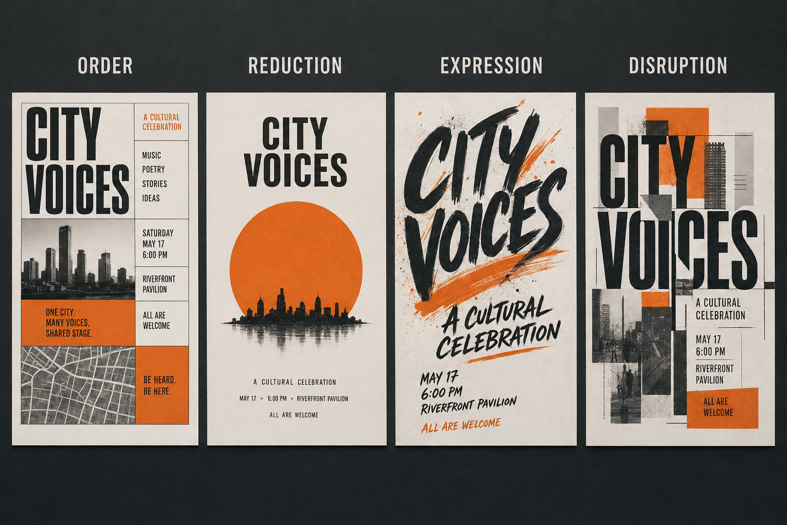
Order and expression are not opposites
The comparison above shows four possible directions for the same event. One uses a visible grid, another reduces the message to a title and symbol, a third makes expressive lettering dominant, and a fourth overlaps and fragments elements. None is automatically better. Each could be successful if it answers the brief and gives the audience an intentional way into the information.
This is why copying the appearance of a designer is less valuable than understanding the principle. Müller-Brockmann and Carson appear very different, yet both control attention. Vignelli and Scher use contrasting levels of restraint, yet both create systems. Bass reduces imagery while Scher amplifies typography, but both make the main idea memorable.
Visual hierarchy changes with the format
Posters
A poster may be seen from a distance and for only a few seconds. Its title, campaign message or focal image needs to work quickly. Supporting information must remain readable when the viewer moves closer.
Editorial design
A magazine spread or programme can reveal information more gradually. Headlines, standfirsts, captions, folios, pull quotes and body text need distinct but related roles. Repeated hierarchy helps the reader navigate several pages.
Brand identity
A brand needs more than a logo. Hierarchy defines how the name, message, imagery, colour and practical information behave across many applications. Consistent rules build recognition, while controlled variation prevents the system becoming lifeless.
Packaging
Packaging may need to communicate brand, product type, flavour or variant, quantity and instructions on a small three-dimensional surface. Hierarchy must work from several angles and remain clear among competing products.
Digital and social formats
A social tile, mobile page and desktop layout do not provide the same space. A successful system adapts rather than simply shrinking. The essential message may need to move, simplify or increase in scale on a smaller screen.
How to plan visual hierarchy before designing
Do not begin by choosing fonts or adding effects. Begin with the communication problem.
- Clarify the purpose. What must the design make the audience know, feel or do?
- Identify the audience. What will they understand already, and in what conditions will they see the design?
- Rank the content. Mark every item as primary, secondary or tertiary.
- Write the shortest accurate message. Editing content is part of design.
- Choose a likely entry point. Decide whether image, word, symbol or number should lead.
- Make small thumbnails. At thumbnail size you cannot rely on detail, so hierarchy becomes easier to judge.
- Develop several genuinely different structures. Change the dominant element, grouping, grid, crop and proportion.
- Test at the intended size and distance. A poster should not be judged only while enlarged on a screen.
A practical hierarchy-testing method
Use the following tests during development rather than waiting until the final design.
- The three-second test: show the design briefly. Ask what was noticed and understood first.
- The blur test: half-close your eyes or reduce the design until details disappear. The main masses and contrasts should still reveal an order.
- The greyscale test: temporarily remove colour. If the hierarchy collapses, colour may be doing too much work.
- The distance test: print the design and view it from the distance appropriate to its purpose.
- The isolation test: list the elements that appear important. If everything is on the list, nothing is truly dominant.
- The sequence test: ask several people to point to the first, second and third things they notice.
Common visual hierarchy mistakes
- Making everything bold. Bold type creates emphasis only in relation to lighter type.
- Using too many focal points. Several large images and headlines can cancel one another out.
- Confusing decoration with communication. Effects should strengthen meaning, not merely fill space.
- Using small differences. A 30-point heading and 27-point subheading may look accidental rather than hierarchical.
- Ignoring the content. A visually impressive word should not dominate if it is not the most important message.
- Relying only on colour. Scale, weight, position and space should also make the order understandable.
- Designing one format and shrinking it. Hierarchy often needs to be rebuilt for a different proportion or viewing distance.
- Breaking rules without purpose. Disruption should contribute to tone, concept or audience experience.
How visual hierarchy can strengthen assessment evidence
Visual hierarchy can connect all four Assessment Objectives. It should be visible in your thinking and development, not only in the final outcome.
- AO1: investigate how relevant designers control scale, sequence, contrast, grid and emphasis. Explain what their choices achieve.
- AO2: test alternative crops, type scales, grid structures, colour emphasis, spacing and image-to-text relationships.
- AO3: record the brief, audience and information priorities. Annotate what viewers notice first and what needs to change.
- AO4: present a resolved response in which the hierarchy suits the intended message, audience and format.
If you are studying this subject at GCSE, see the GCSE Graphic Communication course guide. A Level students can use the more detailed A Level Graphic Communication course guide.
What useful annotation sounds like
Avoid annotations that merely describe appearance: “I made the title bigger” or “I used orange because it stands out.” Explain the communication decision and its effect.
- “The event title now occupies approximately one third of the poster, so it can be recognised before the venue details.”
- “I grouped the date, time and location because the viewer needs these as one practical unit.”
- “The orange accent is reserved for booking information, creating a repeated action point across the poster and social tile.”
- “The diagonal crop created energy but competed with the headline, so I reduced the image contrast behind the type.”
- “The second version is more appropriate for a younger theatre audience because its scale changes create a lively rhythm without hiding essential information.”
Visual hierarchy checklist
| Question | Evidence to look for |
|---|---|
| What should be seen first? | One clear entry point created through scale, contrast, position or imagery |
| What should be read next? | A distinct secondary level that supports the main message |
| Are related items grouped? | Consistent proximity, alignment and spacing |
| Is anything competing unnecessarily? | Decorative effects, images or type styles have been reduced where needed |
| Does the hierarchy suit the audience? | Appropriate pace, tone, readability and amount of information |
| Does it work at the final size? | Printed, distance and small-screen tests have been recorded |
| Does it adapt across formats? | Consistent levels are visible in posters, covers, packaging or digital outcomes |
| Can development be seen? | Thumbnails, comparisons, feedback and refinements explain the decisions |
Frequently asked questions
Does the largest element always come first?
Not always. Strong colour, isolation, a face, sharp contrast or an unexpected position can attract attention before a larger but quieter element. Hierarchy depends on relationships between all the parts.
Can a design have more than one focal point?
Yes, but they should usually operate in sequence or as a deliberate pair. If several focal points demand equal attention without a relationship, the design may feel confused.
Do I have to use a grid?
You do not have to make the grid visible or rigid, but some organising structure is useful. Even expressive layouts benefit from intentional alignments, intervals or repeated proportions. You can bend or break a structure after understanding what it is doing.
Is minimal design automatically clearer?
No. A sparse design can still have weak relationships, while a dense design can have a very clear order. Clarity depends on organisation and emphasis rather than the number of elements alone.
Final advice
Strong visual hierarchy begins with deciding what the audience needs and ends with testing whether they actually notice it in the intended order. Study contrasting designers, but investigate their thinking rather than copying their appearance. Generate several structures, make the differences decisive and record why one direction communicates more effectively.
When hierarchy is working, the design becomes easier to enter, easier to understand and more memorable. The viewer knows where to begin—and every later decision has a reason for being there.
No responses yet