
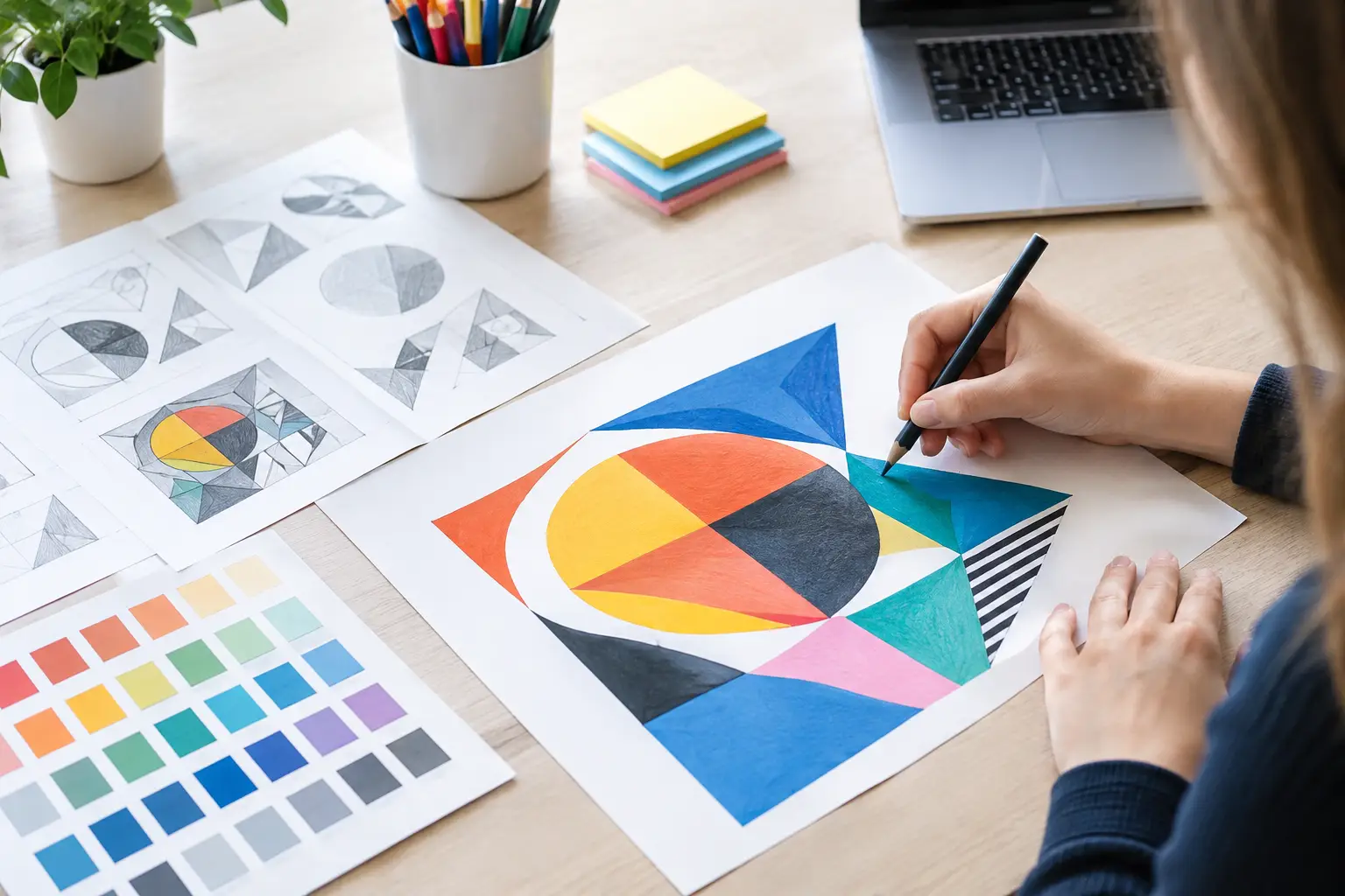
A poster can look polished and still limit your marks if it appears suddenly at the end of a sketchbook. A strong GCSE Graphic Communication project example shows where the idea came from, how it changed, and why the final design suits its audience. That visible journey is what turns a collection of attractive pages into purposeful GCSE coursework.
This example is designed to show the level of connected development examiners want to see. You can adapt the theme, audience and media to suit your own interests, but keep the thinking process clear from the first page to the final response.
Graphic communication project example: Fast Fashion Awareness
The brief is to create a visual campaign encouraging teenagers to buy fewer, better-quality clothes and think about the waste created by fast fashion. The final outcome could be a campaign poster series, a folded leaflet, social media graphics, clothing tags or packaging. A poster series works especially well because it gives you scope to test image, type, colour and layout while communicating one focused message.
The key is not to decide immediately that you will make three posters and then decorate them. Start with a question that gives the project direction: How can graphic design make the hidden impact of fast fashion feel immediate to a teenage audience? This question creates a useful bridge between your subject matter, your audience and your practical decisions.
Your project might develop from the initial idea of discarded clothing into the final campaign line: Wear it longer. Waste less. That progression is simple, but it provides plenty of opportunities to show AO1-AO4.
Start with purposeful visual research
Begin by collecting first-hand and secondary images that genuinely inform design decisions. Photograph overfilled wardrobes, clothes rails, charity shop labels, fabric textures, washing instructions, worn trainers and piles of unwanted clothes. If possible, visit a charity shop or photograph garments at home. Your own images give the project a personal starting point and stronger AO3 evidence than a page of downloaded pictures.
Alongside this, research facts about textile waste, clothing production and consumer habits. Select only information that can become part of your visual communication. For example, a statistic about how much clothing is thrown away each year could inspire scale, repetition or a bold typographic message. Avoid filling pages with facts you never use later.
Annotation should explain your response, not simply describe what is visible. Rather than writing, “This image shows old clothes,” explain what you notice and what it could lead to: “The crowded rail creates a repetitive pattern of shapes. I could use repeated garment silhouettes behind my headline to suggest overconsumption.” This makes your thinking visible.
Research designers for methods, not decoration
Choose graphic designers, photographers or campaigns with a relevant visual approach. You might investigate Barbara Kruger for direct text-image relationships, David Carson for expressive typographic disruption, or a contemporary environmental campaign for its use of striking imagery and concise copy.
Do not try to copy a designer’s finished look. Identify specific methods and test them in your own context. Kruger’s use of a limited palette, large sans-serif type and confrontational statements could lead you to experiment with red, black and white messaging. Carson’s fragmented typography might help you express waste, excess or disconnection. Explain what you selected, why it fits your idea and what you changed.
This is AO1 when the research is informed and relevant. It becomes stronger when your practical work proves that the research influenced later decisions.
Develop a visual language through experiments
At this stage, your sketchbook should become more active. Test several ways of communicating the same message rather than settling on the first idea that looks acceptable. A campaign about fast fashion could use collage, photography, hand-made lettering, digital type, screen printing, torn paper, fabric scraps or image transfer. The best route depends on your intended audience and message.
For example, create a collage from clothing labels and magazine fashion imagery, then photograph it and add digital typography. Next, try a cleaner photographic design using one of your own images of discarded clothing. Then test a type-led poster where the word “MORE” repeats until it becomes an unreadable mass. Each experiment should answer a practical question: does this feel urgent, readable, youthful, wasteful or persuasive?
Record what happened. If a layout is too busy, say so and explain the improvement you will make. If a colour combination has impact but makes the message difficult to read, test a more controlled version. Examiners do not expect every experiment to succeed. They want evidence that you can select, refine and improve your work.
A useful page might show three thumbnail layouts beside short notes. One could use an enormous headline, another could place type over a photograph, and a third could rely on negative space. Compare them in relation to your audience. Teenagers may respond to a bold, immediate message, but a design that is too chaotic can weaken communication. That judgement is part of good graphic design.
Show AO2 by refining decisions
AO2 is often where a project becomes more convincing. It is not enough to produce many experiments; you need to demonstrate that each one has helped you make a better decision.
Suppose your early collage feels visually rich but the message is unclear. You could crop into one area, reduce the number of colours and introduce a short headline. Make this change in stages so the refinement can be seen. Place the first version beside the edited version and annotate the reasons for the changes: “I removed the smaller labels because they competed with the headline. The cropped composition feels more like a clothing advertisement, which makes the environmental message more unexpected.”
Refinement can involve image selection, typeface choice, spacing, hierarchy, scale, colour, print process and format. It does not always mean making a design neater. Sometimes a rough or damaged visual treatment is the right choice, provided it supports the message and remains legible.
You could also test your campaign in context. Mock up the poster on a bus shelter, inside a sixth-form common room or as an Instagram post. This is not just presentation polish. It helps you judge whether the design works at the size and in the environment intended. A tiny detail may look effective in a sketchbook but disappear on a phone screen.
Build towards a final outcome with AO3 evidence
As you approach the final response, gather the source material you need rather than relying on an image you found at the start. Photograph a final clothing arrangement, scan your own fabric collage, create a new set of labels or develop a studio shoot with controlled lighting. These intentional recordings show AO3 and make your outcome more individual.
Plan the final campaign before making it. A clear design sheet can include final dimensions, colour palette, typography, image choice and the campaign line. If you are producing three posters, decide how they work as a set. Perhaps each poster uses the same typeface and colour system but focuses on a different message: buying less, repairing clothes and donating unwanted items.
Keep the number of final pieces realistic. Three connected, well-resolved posters are usually stronger than six rushed designs with no clear relationship. Quality, relevance and visible development matter more than volume.
Present the final response with confidence
Your final outcome should look like the logical result of the project, not an unrelated polished piece. Include photographs or scans that show it clearly, plus at least one image of it in context if that is relevant to the format. Briefly evaluate how successfully it meets the brief and reaches the audience.
A meaningful evaluation might say: “My final posters use the visual language of fashion advertising to challenge the impulse to buy more clothing. The large type works at a distance, while the repeated clothing labels connect directly to my early collage experiments. If I developed the project further, I would test the campaign as short social media animations, as movement could make the repeated message feel even more overwhelming.”
This is stronger than simply saying you are pleased with the work. It shows judgement, awareness of the brief and a clear understanding of your own development.
A successful graphic communication project does not need the most complicated concept or expensive materials. It needs a focused question, relevant research, genuine testing and a final outcome that makes sense because the sketchbook has earned it. Keep asking what each page proves, what it has taught you and what it should lead to next. That is how you present your work with confidence and give every Assessment Objective clear evidence.
No responses yet