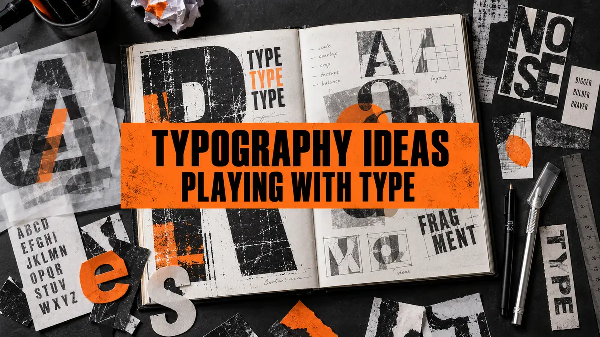
Typography is not simply choosing a font and typing a heading. In Graphic Communication, type can be stretched, cut, repeated, photographed, printed, distressed, layered, animated or built as a three-dimensional object. It can carry information, create a mood and even become the main image in a design.
This guide gives GCSE and A Level Graphic Communication students practical typography ideas for sketchbooks, coursework and final outcomes. You can use the activities with a poster, editorial spread, campaign, identity, packaging, motion graphic or self-directed project. The important thing is to make every experiment connect to a message, audience or intention.
What is typography in Graphic Communication?
Typography is the design and arrangement of written language. It includes the shape of letterforms, the choice of typeface, size, weight, spacing, alignment, colour and the relationship between type, image and empty space. In Graphic Communication, those decisions affect both what a message says and how it feels.
Compare the word whisper set in small, widely spaced pale letters with the same word printed in a heavy, tightly packed block. The spelling has not changed, but the tone has. Type can sound loud, quiet, formal, playful, urgent, luxurious, unstable, mechanical or handmade before the viewer has fully read it.
Start with meaning—not a page of random fonts
A sheet containing twenty fonts may show that you can operate software, but it does not automatically show strong design thinking. Begin with a word, message or brief. Ask what it needs to communicate and how the audience should respond.
- What does the word mean?
- Who needs to read it?
- Where will it appear?
- Should it be read immediately, discovered slowly or partly hidden?
- What emotion, action or atmosphere should the type create?
- Which material, process or form would strengthen that meaning?
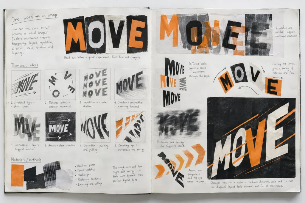
For example, MOVE suggests direction, speed and change. You could rotate letters, repeat them like animation frames, add a blurred shadow or make the baseline rise. PRESSURE might be compressed against the edges of a page, trapped inside a narrow box or printed so heavily that the paper appears damaged. The visual treatment grows from the idea.
Typography ideas you can try
1. Change scale, weight and spacing
Use extreme contrast rather than changing everything slightly. Make one letter enormous and crop it at the edge. Set another word so small that the viewer must move closer. Compare thin and heavy weights. Pack letters together until they collide, then spread them so far apart that the empty spaces become important.
Learn the basic vocabulary as you work: kerning is the space between particular pairs of letters; tracking adjusts spacing across a group of letters; and leading is the vertical space between lines. You do not need to use technical words in every annotation, but understanding them helps you make precise decisions.
2. Cut, fold and rebuild letters
Print or draw a word several times. Cut the letters into strips, remove sections, swap parts between characters or rebuild them from geometric shapes. Fold letters so they cast shadows. Weave two words together. Photograph each stage before sticking anything down so that one experiment produces several possible outcomes.
3. Distress and damage type purposefully
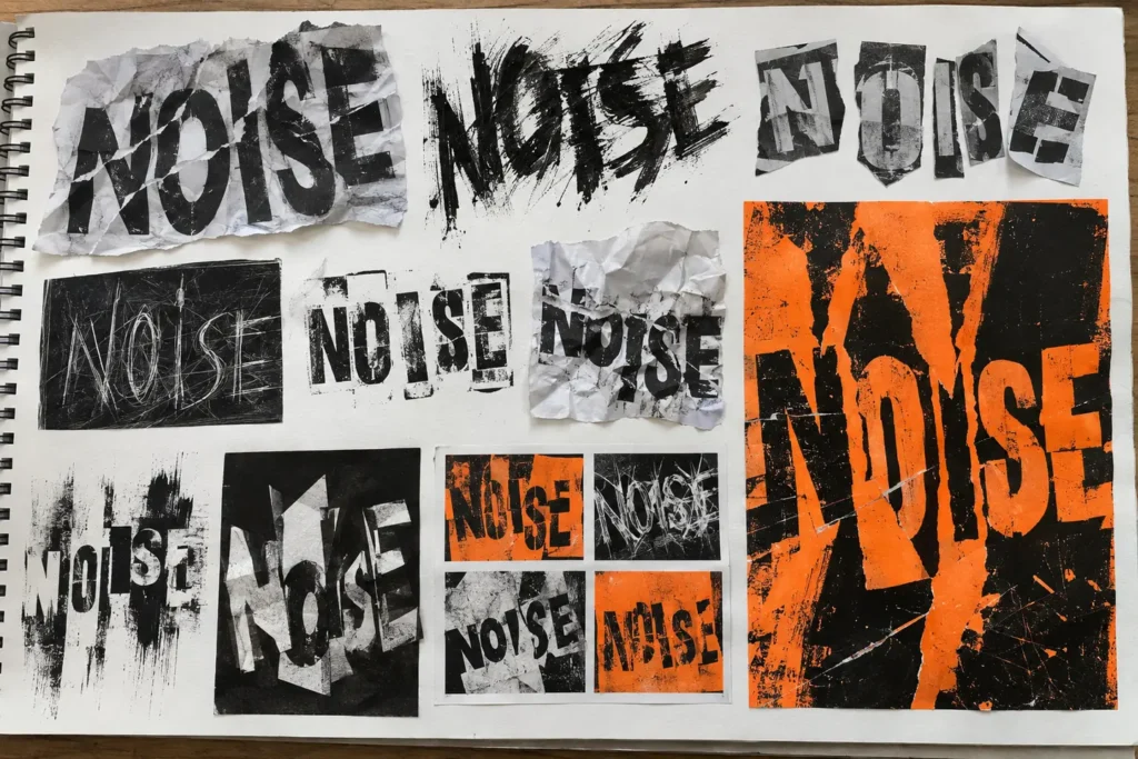
Distressed typography can suggest age, conflict, noise, memory, decay or rebellion. Try tearing, sanding, scratching, crumpling, overprinting, dry-brushing, smudging, photocopying repeatedly, printing onto textured surfaces or removing ink with tape. The aim is not to add a fashionable “grunge” effect at random. Choose a process because its physical qualities support your idea.
4. Make type from unexpected materials
Build letters from string, tape, wire, cardboard, fabric, food, found objects, natural forms or light. Match the material to the message: wire may suit connection or restriction; ice could communicate fragility or climate; thread could suggest identity, repair or family. Photograph the letters from several angles and under different lighting. Your photograph can become the final design or raw material for further digital work.
5. Photograph type through surfaces
Place printed words behind rippled water, textured glass, transparent plastic, steam or reflections. Project type onto a face, building, folded paper or moving fabric. Use a slow shutter speed to drag illuminated letters through the frame. Photograph shadows cast by three-dimensional words. These methods combine typography with original photography, giving you useful evidence for recording and experimentation.
6. Use print and duplication
Carve a simple letter into foam or lino, cut a stencil, make a collagraph plate or use a gel plate. Repeat the print with different pressure, ink, alignment and transparency. Misregistration—the slight movement between printed layers—can make type appear unstable or energetic. Scan the most successful results and combine them with cleaner digital type to create contrast.
7. Manipulate type digitally
Convert type to editable outlines only after keeping an untouched copy. Then stretch selected parts, cut through letterforms, merge letters with shapes, alter counters, build custom ligatures or place type on a path. Try displacement maps, masks, scans, pixel sorting or simple frame-by-frame movement where appropriate. A digital effect should still be tested against meaning, readability and the brief.
8. Turn type into an image
Use repeated words to build tone in a portrait, landscape or object. Construct an image from letter fragments. Replace parts of a photograph with matching type. Let a word form the silhouette of what it describes, but avoid the most obvious solution: instead of simply bending the word wave into a wave, investigate rhythm, reflection, erosion, sound or changing density.
9. Let type interact with an image
Type does not always have to sit neatly above a photograph. It can follow an edge, disappear behind a figure, break across several panels, echo movement or reveal part of an image through its letterforms. Test the balance carefully: if the message must be understood quickly, expressive placement should not destroy the essential information.
10. Animate the typography
If your course allows motion work, make letters appear, collide, dissolve, shake or change weight over time. Start with a storyboard. Decide when each word enters, how long it remains readable and how movement supports tone. A short, purposeful ten-second sequence can provide stronger development than a long animation filled with unrelated effects.
Designers and artists to investigate
Research practitioners because their work can help you solve a problem—not because you need a famous name on a page. Analyse particular examples, identify a useful principle and then test that principle with your own wording, imagery and context.
- Paula Scher and the Public Theater: investigate scale, weight, condensed type, visual hierarchy and how a flexible typographic identity can feel energetic while remaining recognisable.
- David Carson: explore fragmented layouts, distressed surfaces and expressive typography that sometimes asks the reader to slow down. Do not simply make work messy; consider why order is being disrupted.
- Neville Brody and Brody Associates: look at experimental letterforms, editorial design and how a custom type system can give a publication or identity its own voice.
- Barbara Kruger: examine how direct language, scale, contrast and image create confrontational messages. Develop your own original statement rather than borrowing one of hers.
- Jenny Holzer: consider how the location, material, light and movement of words change the way an audience encounters them.
You can also explore the International Society of Typographic Designers and the D&AD archive for examples of typography used in real communication. If you need legitimately licensed typefaces for coursework, Google Fonts provides a searchable collection; always check the licence of any font or asset you download.
GCSE typography exemplar: developing the word MOVE
A GCSE student begins with the word MOVE and creates small thumbnails based on direction, repetition, rotation and speed. They cut letters from black and orange paper, repeat the word at different sizes, photograph a smudged version and test diagonal arrows. The first trials are quick and uneven, but they make different ideas visible.
The student then selects the diagonal layout because it feels energetic and remains readable. They combine the strongest features—large cropped letters, directional lines and a limited colour palette—into a poster. Their annotation explains why the idea was selected and what they would improve, rather than merely saying “I used black and orange because they look good.”
What makes this useful GCSE evidence?
- One clear starting word leads to several different visual possibilities.
- Handmade and photographic processes are used alongside layout thinking.
- The student selects and combines successful features.
- The final idea visibly grows from earlier tests.
- Annotation records a decision and a next step.
For wider course guidance, read the GCSE Graphic Communication course explained and the guide to GCSE AO2 experimentation and refinement.
A Level typography exemplar: exploring PRESSURE
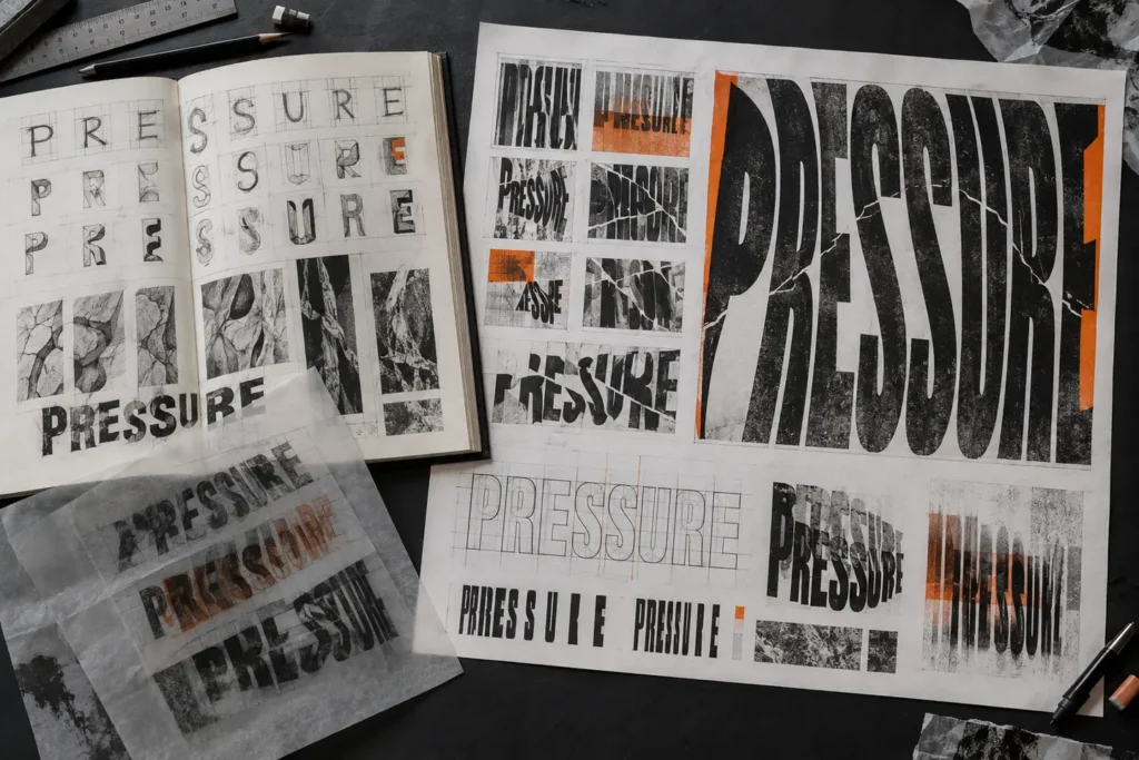
At A Level, the investigation needs greater depth and independence. A student exploring PRESSURE might begin with first-hand photographs of cracks, compressed packaging, fingerprints or objects trapped between surfaces. They analyse how selected practitioners use scale, distortion and space, then develop a hand-built letter system rather than relying entirely on ready-made fonts.
They test compression in several ways: squeezing letters against the edge of the format, narrowing counters, breaking forms along photographed cracks, overprinting translucent layers and changing the amount of readable information. Tracing-paper overlays allow ideas to be compared without hiding previous decisions. The student evaluates whether each method communicates physical, social or psychological pressure and uses that judgement to refine a final series.
How the A Level approach goes further
- The theme is narrowed into a personal line of enquiry.
- First-hand recording supplies original visual material.
- Contextual research changes the student’s process and decisions.
- A custom visual language is developed across several connected experiments.
- Legibility is tested as a deliberate variable, not ignored accidentally.
- The student considers meaning, audience, format and context as well as appearance.
See the A Level Graphic Communication course explained for more about the standard of investigation, refinement and independence expected.
A Level applied exemplar: building the SHIFT identity
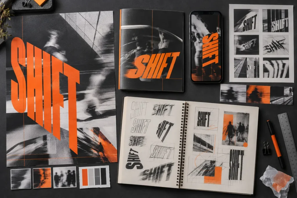
Typography can also be one part of a larger design solution. For a fictional cultural event called SHIFT, a student develops letterforms that lean, split and change direction. They combine the wordmark with their own motion-blur photography, then test it on a poster, programme cover and phone-screen graphic.
The outcome is not just one attractive poster. It is a small visual system. The scale and orientation change across formats, but the limited palette, angled letterforms, grid and photographic treatment keep the identity connected. This demonstrates that expressive typography can remain functional when it is adapted with care.
Project starting points for playing with type
- Sound: visualise echo, bass, silence, distortion or rhythm through letterform and spacing.
- Identity: build an alphabet from handwriting, family objects, local signs or a personal collection.
- Place: create type from architectural shapes, street markings, shadows or found lettering in your area.
- Emotion: compare how the same sentence changes when it appears controlled, anxious, joyful or angry.
- Environment: make temporary words from natural or discarded materials and document their change.
- Memory: layer, erase, blur or reconstruct text to show how information is lost and recalled.
- Technology: explore glitches, pixels, scanning, data, variable fonts or communication overload.
- Campaign: develop an original short message and test how type can persuade different audiences.
- Movement: use sequence, blur, repetition or animation to make type behave over time.
- Rules and rebellion: establish a strict grid and then decide exactly where and why to break it.
How typography can provide evidence for AO1–AO4
| Assessment Objective | Useful typography evidence |
|---|---|
| AO1: Develop ideas | Focused research into relevant designers, artists, historical lettering, signs or visual systems; analysis followed by your own practical response. |
| AO2: Explore and refine | Controlled tests of materials, type structures, scale, spacing, legibility, colour, print, digital processes and formats; comparison and selection. |
| AO3: Record | Original photographs, drawings, found-type surveys, word maps, thumbnails, grids, screenshots, print proofs and annotations that explain decisions. |
| AO4: Present | A resolved poster, editorial piece, identity, package, campaign, animation or installation in which typography clearly grows from the investigation. |
A strong page may provide evidence for several objectives at once. Photographing handmade letters records a first-hand source; comparing the photographs supports experimentation; analysing a designer provides context; and applying the chosen treatment to a final outcome helps realise your intention. Keep the journey connected.
If you need to strengthen the wider project around these experiments, explore the GCSE Art Help or A Level Art Help sections. GCSE students can also use the guide to what to put in a GCSE Art sketchbook to present typography research, development and decisions as a connected journey.
How to annotate typography experiments
Avoid annotations that only name the software, font or colour. Explain the visual effect and connect it to your intention. A useful structure is:
I tested ______ because I wanted the word to communicate ______. The most successful feature is ______ because ______. However, ______ reduces clarity at ______ size. Next, I will combine ______ with ______ and test it in/on ______.
Example: “I compressed the letters until they touched the border because I wanted PRESSURE to feel physically trapped. The narrow counters strengthen the idea, but the second version becomes unreadable at phone size. Next, I will keep the compressed outer shape while reopening the counters and test it on a poster and social tile.”
Common typography mistakes to avoid
- Using random fonts as “experimentation”. Control one variable at a time and explain what you are testing.
- Distressing everything. Texture needs a reason and should not erase essential information.
- Copying a famous designer’s layout. Extract a principle, then apply it to your own content and purpose.
- Ignoring spelling and proofing. Expressive type still needs accurate information unless an alteration is intentionally part of the concept.
- Only showing the computer screen. Include thumbnails, print tests, failures, comparisons and physical outcomes.
- Making one polished result too early. Generate alternatives before deciding which direction deserves refinement.
- Forgetting the audience. A festival poster, medicine package and protest message demand different levels of clarity and tone.
A practical typography mini-project
- Choose one meaningful word linked to your project.
- Write five qualities the word should communicate.
- Collect and photograph relevant textures, objects, signs or environments.
- Research two contrasting practitioners and identify one useful principle from each.
- Create at least twelve small thumbnails using scale, spacing, cropping, rotation and repetition.
- Make three physical experiments using different processes.
- Scan or photograph the results and develop three digital combinations.
- Test the strongest idea at its intended size and in its intended context.
- Ask someone in the target audience what they notice, feel and understand.
- Refine the design and present the process beside the outcome.
Frequently asked questions
Do I have to draw my own lettering?
No. You can begin with an existing, appropriately licensed typeface, found lettering or your own hand-drawn forms. However, changing and testing letterforms can make your response more personal. Keep evidence of the original and each important stage so the development is clear.
Is typography just for Graphic Communication?
No. Fine Art students may use text as subject matter, material or installation, while Photography students can document signs, project words, use long exposures or combine text and image. Graphic Communication usually places greater emphasis on audience, purpose, hierarchy, legibility and application.
Can type be partly unreadable?
Yes—if that choice supports the intention and the essential information remains appropriate for the context. Delayed reading can create curiosity or express confusion, censorship and overload. Accidental illegibility caused by poor contrast or careless spacing is different.
Which software should I use?
Use whatever your school provides and you can operate safely: vector, image-editing, page-layout, animation or presentation software may all be useful. Software is a tool, not the idea. Handmade type photographed with a phone can be excellent evidence when it is purposeful and well developed.
How many typography experiments should I include?
There is no correct number. Include enough relevant alternatives to show genuine exploration, selection and refinement. Six purposeful tests that lead somewhere are more valuable than thirty random font changes.
What is the difference between GCSE and A Level typography work?
Both levels need research, experimentation, recording and a resolved response. At A Level, expect greater independence, depth, critical understanding, technical control and a more sustained connection between concept, process, audience and outcome. The difference is not simply using more complicated software.
Can I use AI-generated type or images in my coursework?
Follow your school and exam board’s current instructions. Any permitted digital tool should support your own thinking rather than replace it. Your portfolio must make your sources, decisions, experiments and individual contribution clear. Never submit generated work as though you made it unaided.
Would an independent portfolio review help?
If you are unsure whether your typography experiments show enough development—or whether the final design connects clearly to AO1–AO4—Portfolio to A Star can provide practical, personalised guidance based on the evidence visible in your work.
No responses yet